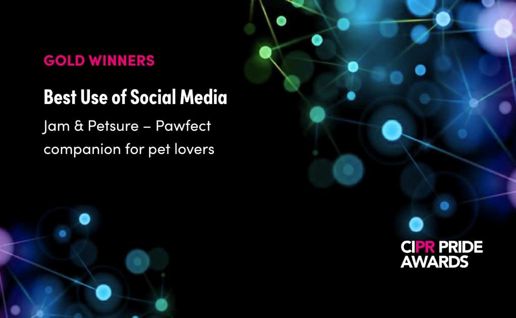
Silver Marketing Association Member | CIPR | MPA Inspiration Award
Last year we generated over 1.3 Billion opportunities to see for our clients.
Our dedicated communications team develop captivating projects that engage audiences and enhance brands.
- Tab One
- Tab Two
- Tab Three
- Tab Four
- Tab Five
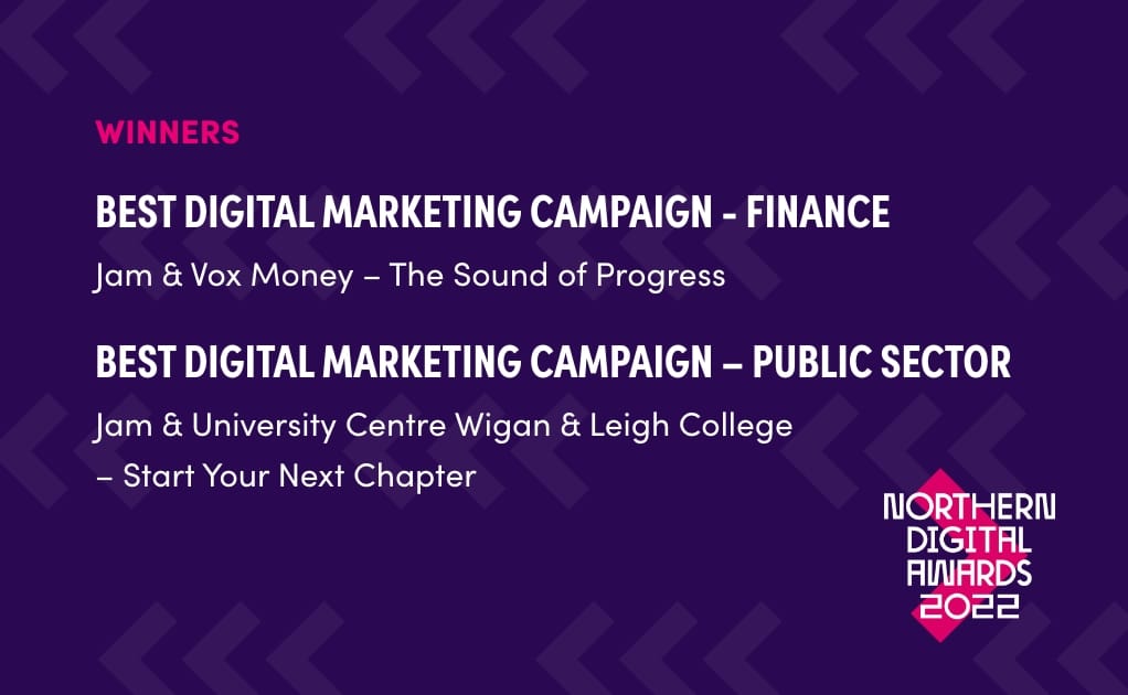
x2 Northern Digital Awards 2022
Best Digital Marketing Campaign:
Financial Services & Public Sector
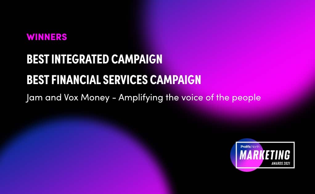
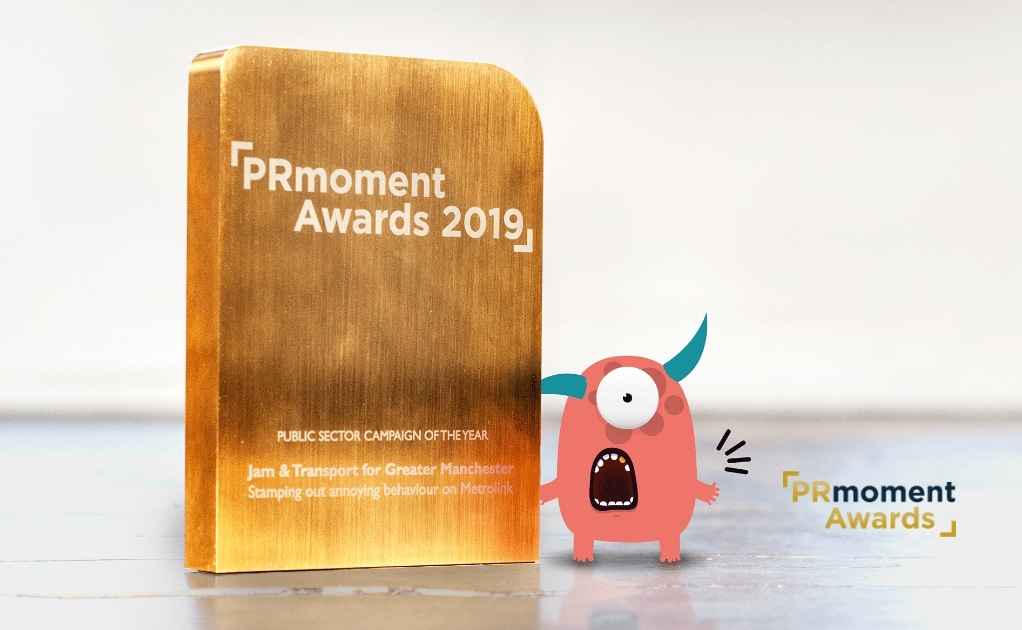
We’re proud to deliver award-winning communications
campaigns that exceed our clients’ expectations.